Credits
Client
YCCH 潁川國文
Catg.
Web
Visual Designer
Chia Hao Miao
Year
2025
Concept
穎川國文網頁設計理念:核心以品牌名稱中的「川」字為靈感,將其變形為重重疊疊的流水圖形,象徵小川生生不息的活力與連綿不絕的意象,傳達知識如河流般源源不斷的哲理。
頁面背景融入筆記本格線元素,呼應學習過程中常用的筆記本,營造親切、結構化的教育氛圍,讓用戶彷彿置身於日常學習環境。
YCCH 潁川國文
Web
Chia Hao Miao
2025
穎川國文網頁設計理念:核心以品牌名稱中的「川」字為靈感,將其變形為重重疊疊的流水圖形,象徵小川生生不息的活力與連綿不絕的意象,傳達知識如河流般源源不斷的哲理。
頁面背景融入筆記本格線元素,呼應學習過程中常用的筆記本,營造親切、結構化的教育氛圍,讓用戶彷彿置身於日常學習環境。

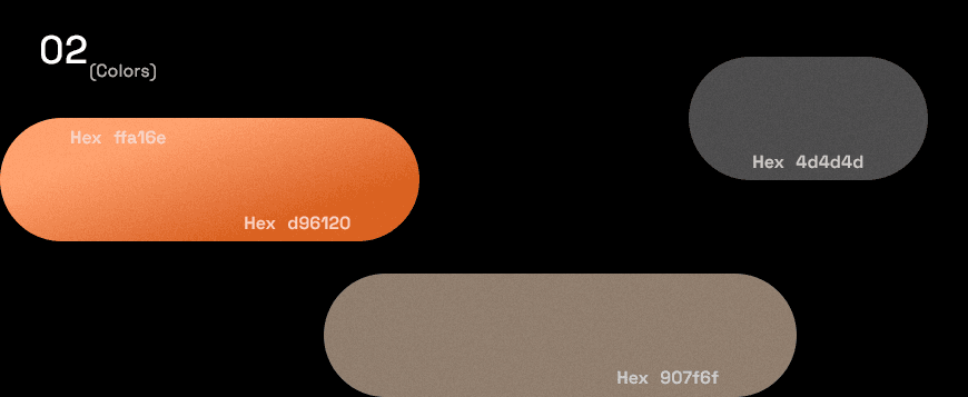
動態呈現則採用波浪形式的動畫,表現水一般的流體造型,直接回應「川」的本質,增添網頁的活潑與互動性。顏色方案選用暖色調,如米黃與淡橙,營造古時宣紙的溫潤材質氛圍,注入古典中國文化的韻味。
整體設計強調教育流動性與傳統美學的融合,適合國文教學平台,提供用戶溫暖、沉浸式的瀏覽體驗。


回到列表


YCCH 潁川國文
Web
Chia Hao Miao
2025
穎川國文網頁設計理念:核心以品牌名稱中的「川」字為靈感,將其變形為重重疊疊的流水圖形,象徵小川生生不息的活力與連綿不絕的意象,傳達知識如河流般源源不斷的哲理。
頁面背景融入筆記本格線元素,呼應學習過程中常用的筆記本,營造親切、結構化的教育氛圍,讓用戶彷彿置身於日常學習環境。
動態呈現則採用波浪形式的動畫,表現水一般的流體造型,直接回應「川」的本質,增添網頁的活潑與互動性。顏色方案選用暖色調,如米黃與淡橙,營造古時宣紙的溫潤材質氛圍,注入古典中國文化的韻味。
整體設計強調教育流動性與傳統美學的融合,適合國文教學平台,提供用戶溫暖、沉浸式的瀏覽體驗。
回到列表